The Evolution of a Book Cover- The Sunset Rises: A 1990s Romantic Comedy
I self-published my one-and-only novel The Sunset Rises: A 1990s Romantic Comedy about a year ago, and the most favorable comments I get are about the cover. That makes sense. Even people who don’t read the book will see the cover. Even people who didn’t care for the book too much said positive stuff about the cover.
Don’t get me wrong. A lot of people have made positive comments about the content of my book as well, but I know The Sunset Rises: A 1990s Romantic Comedy isn’t for everyone. In fact, it can actually be a little polarizing.
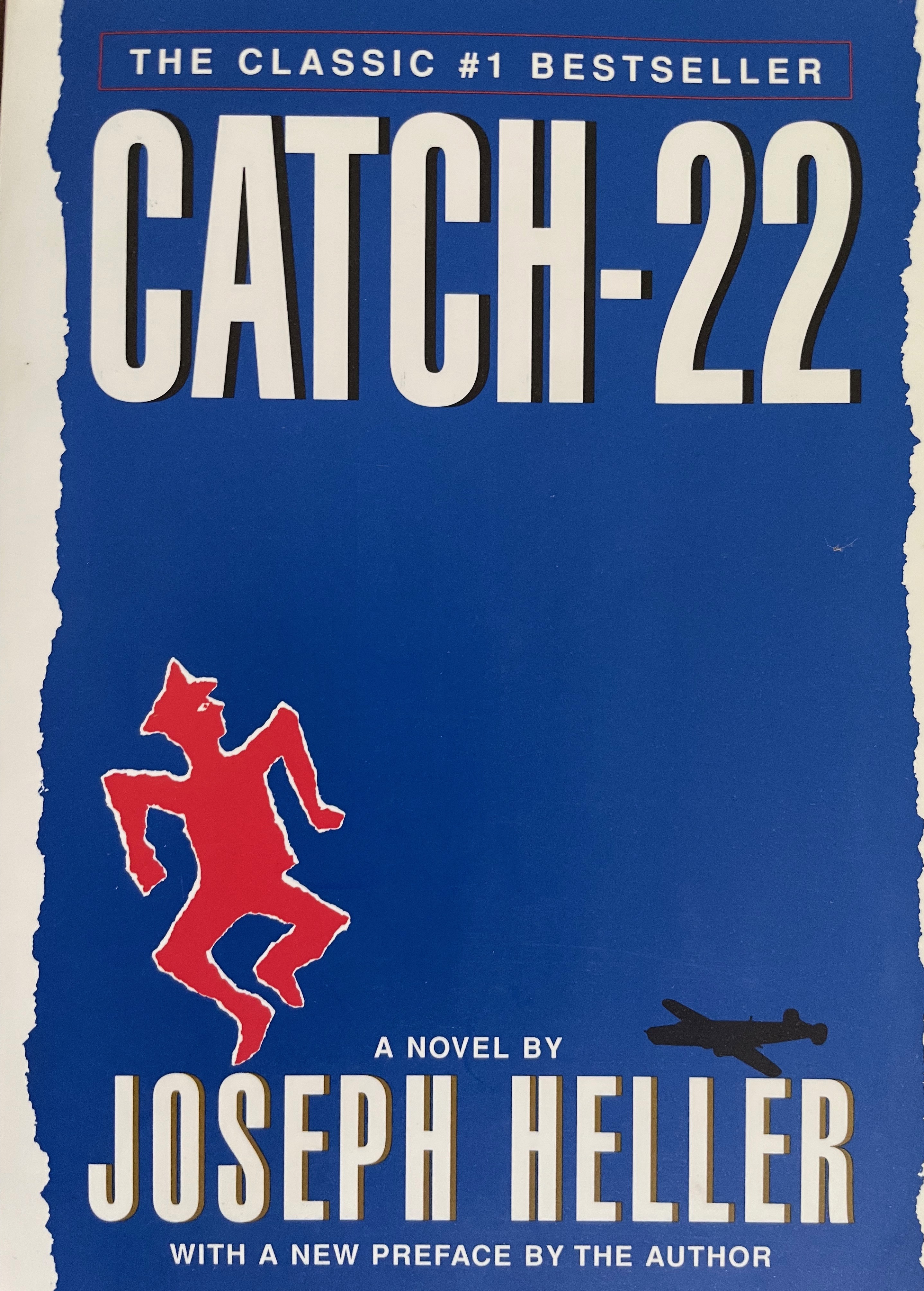
After I was finished writing and revising and revising, I had no idea what I wanted in the cover because all I was interested in was trying to write a decent novel when I’m not a novelist. As far as the cover was concerned, I just wanted something that might stand out a little bit. I figured I’d look at iconic covers and see if there was something I could rip-off from one of them. For a few weeks, I scoured book sites and stared at hundreds of famous book covers, but the cover of Joseph Heller’s Catch-22, a novel that I had sitting on my book shelf, stood out to me the most.
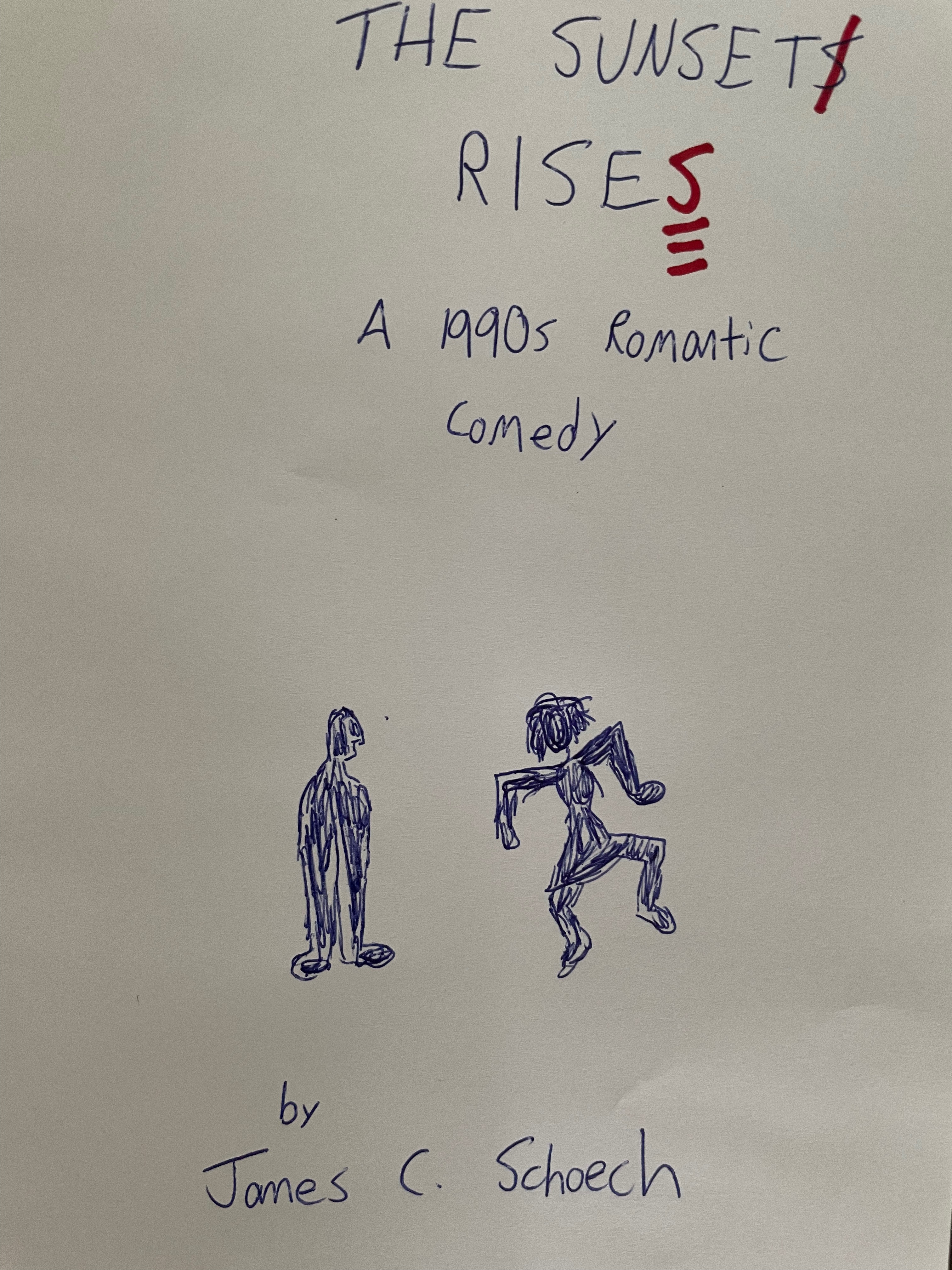
The dancing outline, I thought. I could rip-off the dancing outline.
In fact, I could have two outlines, a hot chick outline dancing crazy and dude outline watching her. I’m not sure my hand drawn outline comes across as an attractive woman, though. I’m not an artist. Even some professional artists can’t draw attractive women very well, so I don’t feel bad about my artwork. I still consider my older brother the artist in the family.
Actually, my uncle is “the” artist in my family, but that’s for another blog post.
I also threw in some editing marks in the title since the main character is an English teacher. I was pretty sure the editing marks would be distracting and confusing, but this was a rough draft cover, and I always include some bad ideas in my rough drafts.
I went to the website 99Designs and sent in my artwork (or whatever that is) to a designer named Setz who always responded within 24 hours (that’s a big deal to me. I don’t expect an immediate response; 24 hours is good). This was the first cover design.
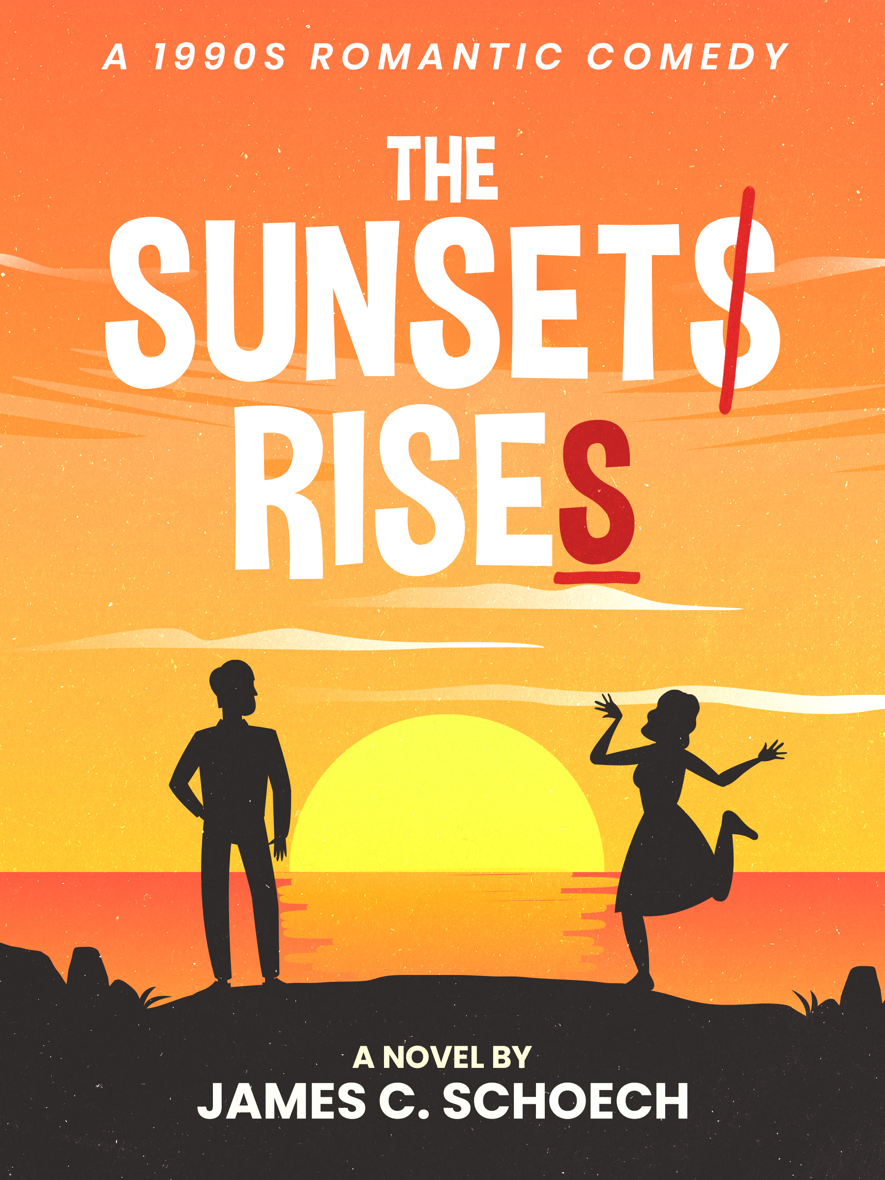
This was the right track, I thought. The editing marks definitely didn’t work, so I asked to see just a normal title.
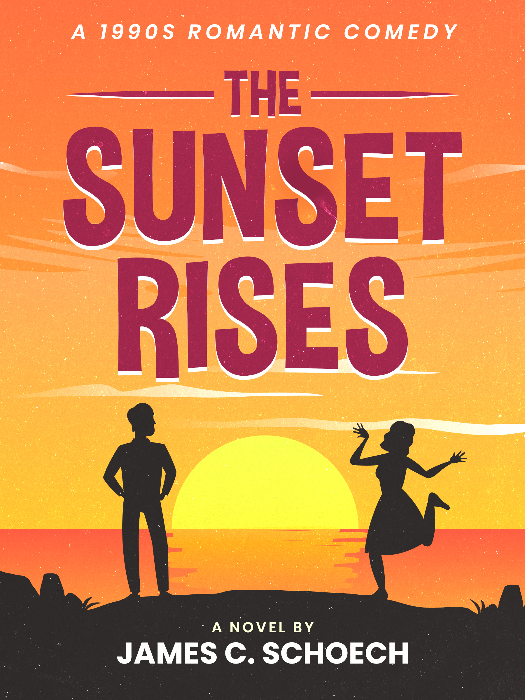
Much better. But I wondered if the dancing female looked more 1950s or 1960s than 1990s, so I asked for an “updated” version.
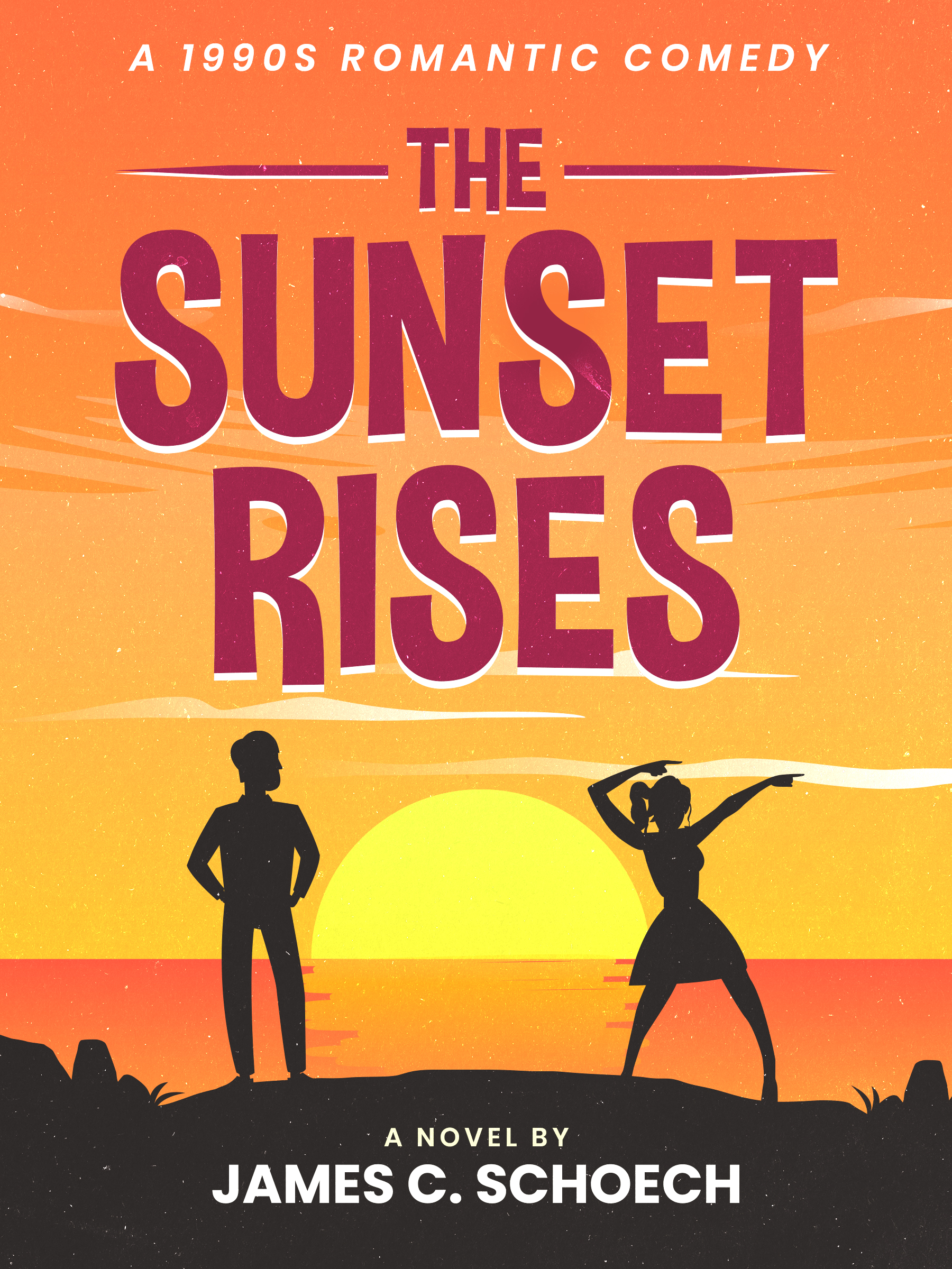
Yes! Then I asked for a lower case ‘s’ in ‘1990s’ so that the ‘s’ didn’t look like a 5. And I asked for the color to be filled in a little more. I might have been getting nitpicky at that point, but Setz still came through within 24 hours.
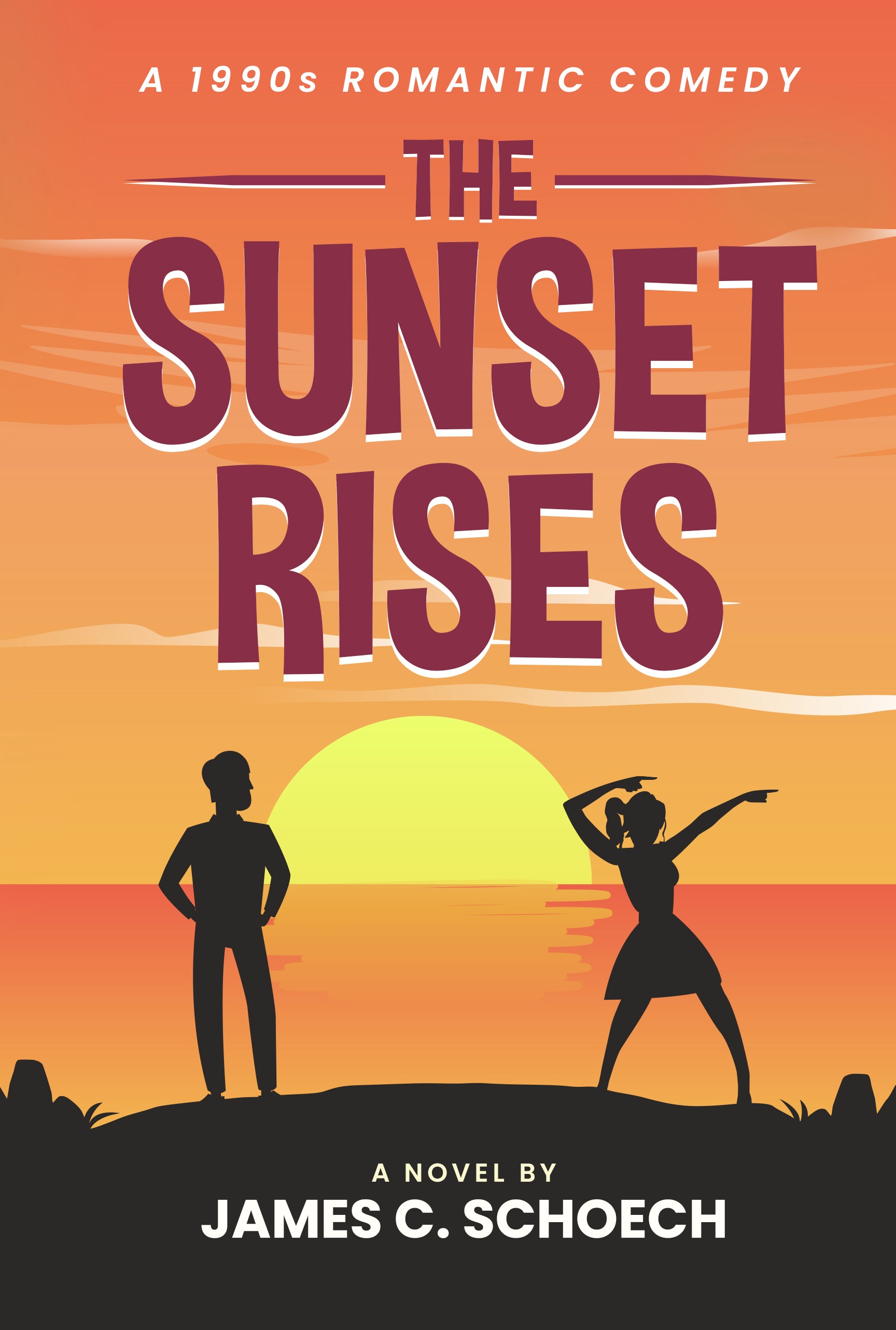
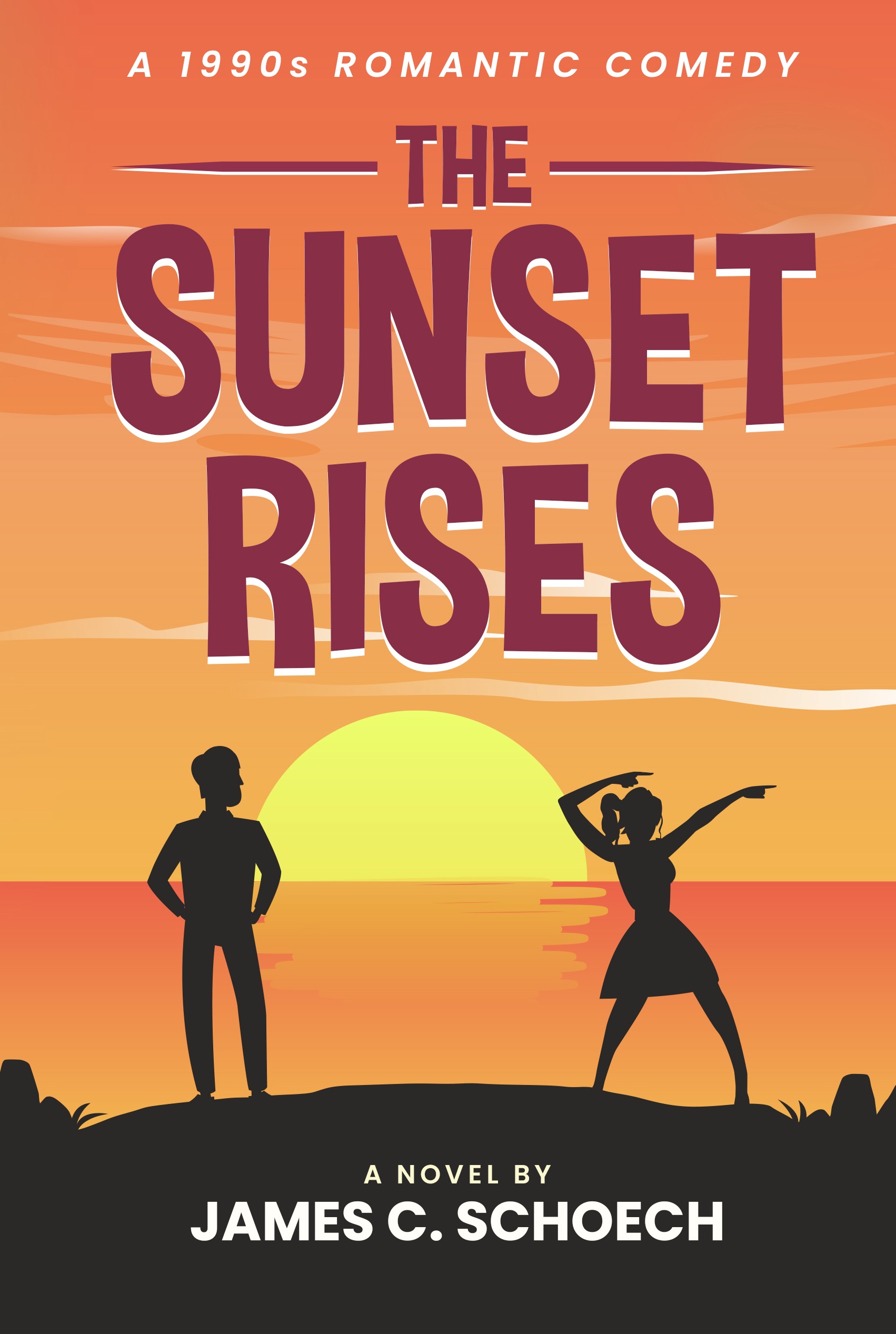
This was it! I was happy.
Oh yeah! I can’t forget the back and front cover spread.
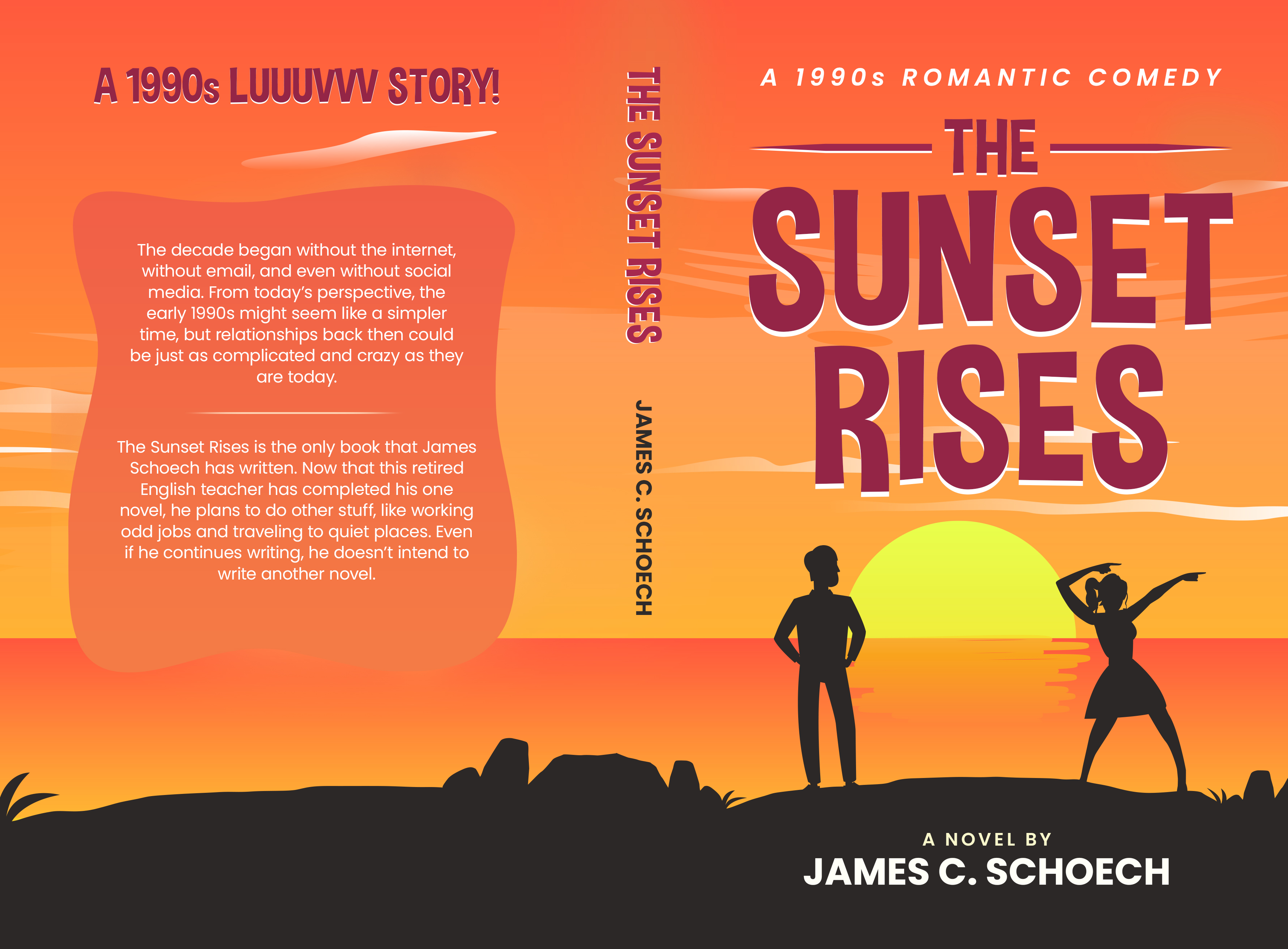
Of course, you can find The Sunset Rises, A 1990s Romantic Comedy here on Amazon!!
Or you can buy it below from the ‘trunk of my car.’
The Sunset Rises: A 1990s Romantic Comedy
Get a signed copy of my one and only novel, The Sunset Rises: A 1990s Romantic Comedy. Free delivery in the United States!
$10.00
And for more about The Sunset Rises: A 1990s Romantic Comedy…
The Main Character Of My Novel Is Not A Simp!
At Least I Know That My Book Doesn’t Suck!
Why Did I Write A Romantic Comedy When I Don’t Read or Watch Romantic Comedies?


Interesting story of the cover creation, thanks for sharing the various stages of design. I’ve played with some of the various design templates that are available for free but they always come out looking like something that was … available for free. I’m wondering why the girl is facing away from the dude. I kind of want her to be facing the dude, but maybe it makes more sense that she isn’t.
You’re right that it makes sense that she faces away from him, but that wasn’t intentional. The cover just worked out that way.
I thought about designing the cover myself, but I’d take too long figuring everything out, and then I’d get mad and probably break everything. I was definitely better off working with somebody else.